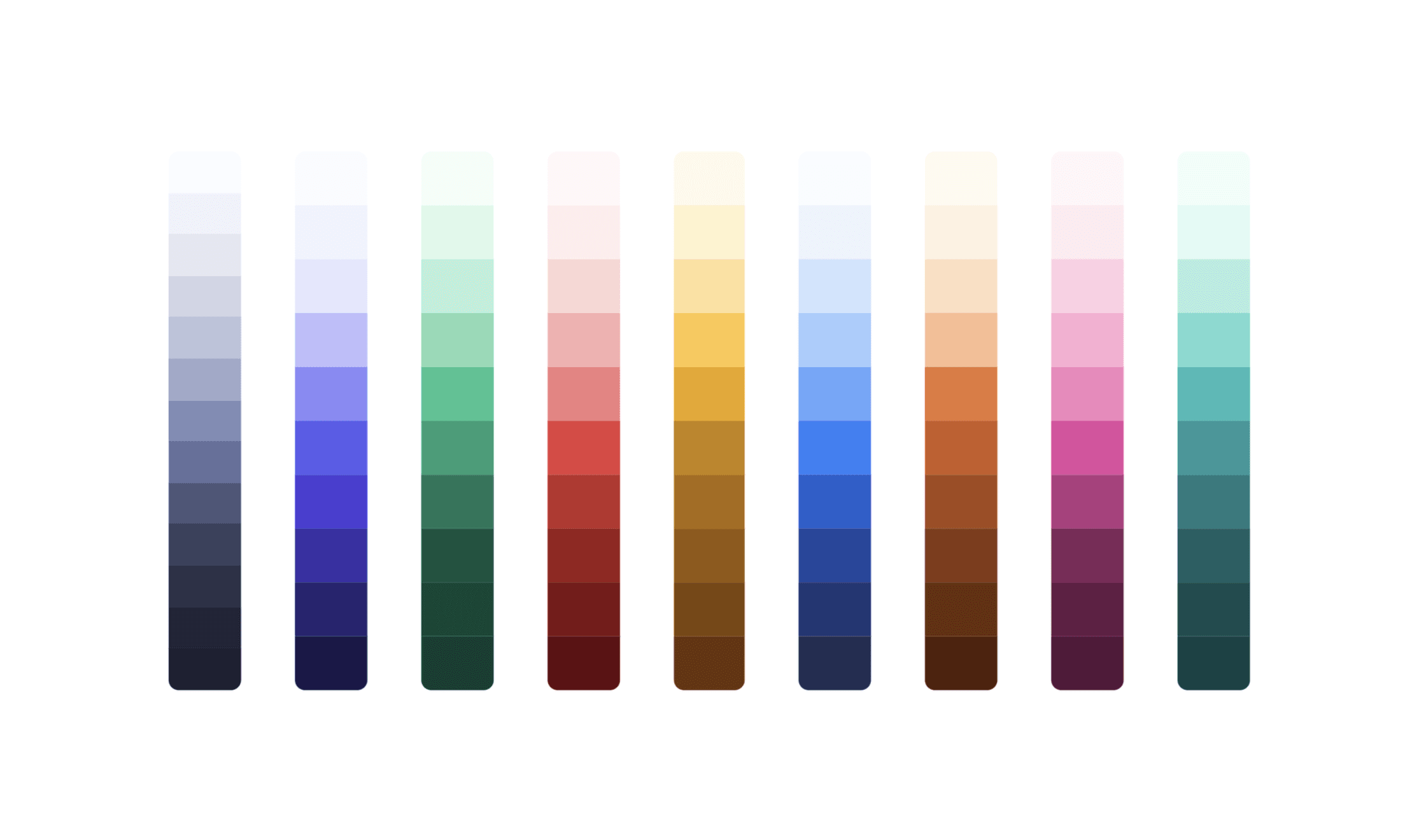
As designers, we're always striving to deliver the best user experience with the prettiest UI possible. But imagine this: what if the colors we use aren't accessible or coherent enough? Are we unintentionally causing more problems than we're solving?
Where we started
Before this project, our color system was anything but systematic:
- Most text and background combinations didn't pass AA contrast, not even our primary button.
- Some buttons looked disabled when they weren't.
- Hues were inconsistent across color groups.
- Mid-shades were handpicked, without a clear structure behind them.
This approach might work for small projects, but it wasn't sustainable for a growing design system.
The challenge
Color is deeply subjective. How it's perceived depends on screens, environments and even cultural context. Without a structured system, ensuring consistency and accessibility was nearly impossible, especially whenever we needed to add a new shade.
A perceptual palette
Instead of picking shades by eye, we generated them in HSLuv, a human-friendly alternative to HSL. GitHub's Primer and Shopify's Polaris use the same approach. In HSL, a yellow and a blue with the same "lightness" look completely different. In HSLuv they don't, so contrast stays consistent from one hue to the next.
We built every scale in GitHub's Primer Prism, tuning hue, saturation and lightness as curves and checking contrast at every step.
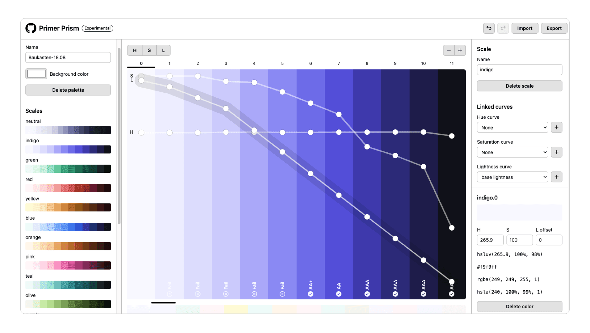
Every color group shares the same lightness curve, and the step names come straight from it: 50 is 98.5% lightness, 1000 is 5%. The main color of each group sits at 600, 45% lightness.
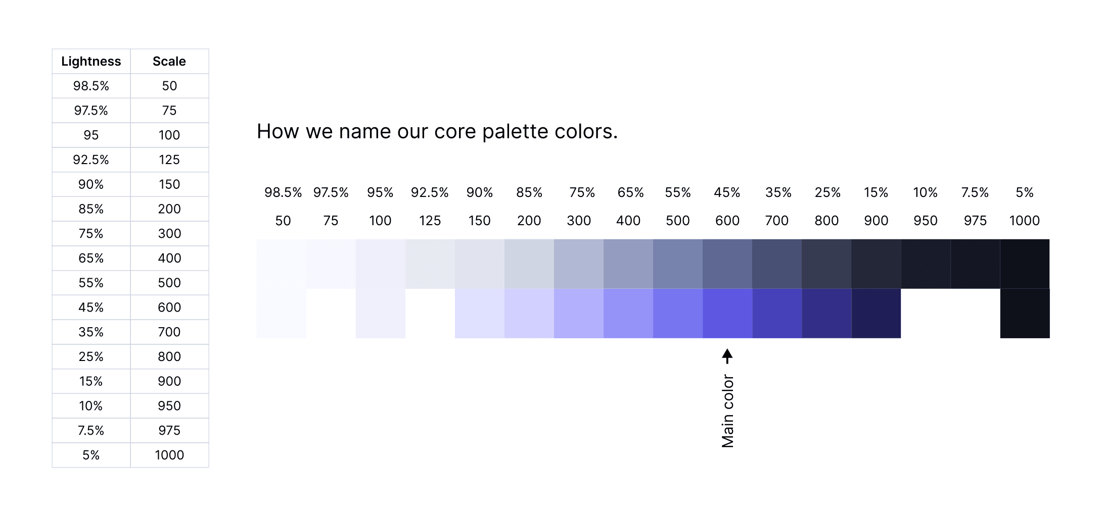
That gives us two rules:
- Every
-600shade meets AA contrast on white, so it's safe for text, icons and solid buttons. - The same step has the same lightness across groups, so swapping one color group for another doesn't change the visual weight of a component.
Same step, same contrast
The second rule is easiest to see in the numbers. These are the main text colors from every group in Baukasten today. Different hues, but each one lands between 5.2:1 and 5.4:1 on white.
Accent text colors · contrast on white
indigo
#5d57e1
5.36:1
blue
#3161df
5.38:1
green
#1a7b5e
5.20:1
yellow
#9a6000
5.19:1
red
#c33634
5.39:1
orange
#a95220
5.36:1
teal
#1d757d
5.39:1
olive
#547431
5.36:1
pink
#b43d80
5.36:1
purple
#7355cc
5.38:1
The yellow exception
One group didn't fit. A yellow that still looks yellow can't carry white text: our first warning button only reached 3.45:1. We looked at three ways out: a darker, more ochre yellow, a light yellow with dark text, or switching warning to orange.
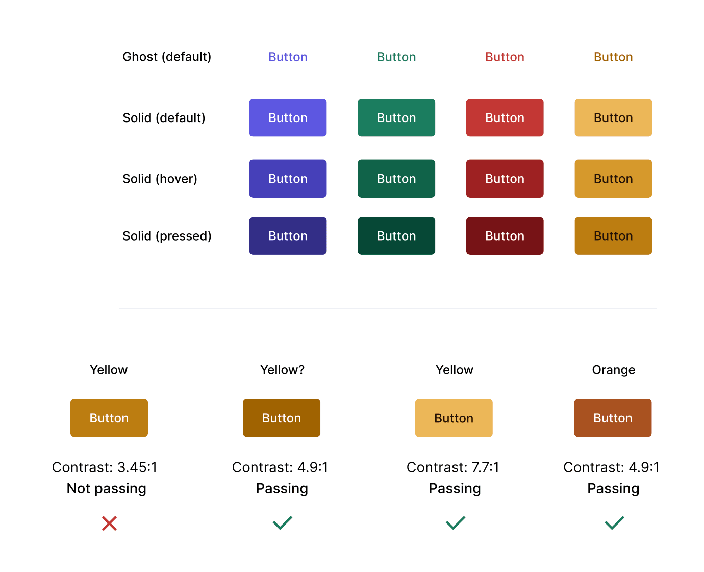
We kept yellow and darkened it: today's warning color, #9a6000, passes AA with white text at 5.19:1.
The result
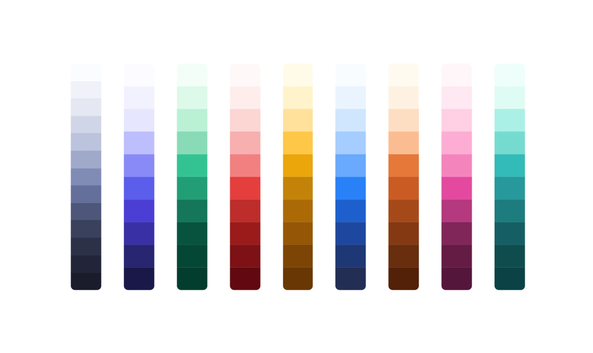
The new system not only improved accessibility but also streamlined the design process. With predictable steps and built-in contrast guarantees, it's much easier to expand the palette, and much harder to accidentally ship something that isn't readable.
The palette is only the first layer, though. How these colors became semantic design tokens is a story of its own.