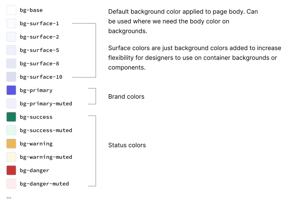
A perceptual color palette tells you which colors exist. It doesn't tell you which one to pick. That's the job of design tokens, and Baukasten didn't have good ones.
What wasn't working
Our old setup had a few recurring problems:
- Core colors were used directly in designs. A name like
gray-500gives no clue where it belongs, so designers couldn't tellprimary-400fromprimary-500and made arbitrary choices. - Every design needed a color check, because non-semantic names were so error-prone.
- Semantic names only existed at component level, which meant far too many tokens with far too long names.
- No CSS custom properties, so theming was hard. On top of that, our CSS-in-JS setup wasn't supported in React Server Components.
Goals
We set ourselves a short list:
- A clear token taxonomy where the name explains where the token is used.
- Avoid component-specific tokens unless a design consideration truly outweighs system thinking.
- The same names in Figma and in code, so design and engineering share one language.
- Keep it simple, with no useless parts.
Two layers, not three
Many systems use three layers: core tokens hold values, semantic tokens point at core tokens, and component tokens point at both. We dropped the third.
1. Color value
#5d57e1
2. Core token
indigo-600
3. Semantic token
bg-primary
4. Component token
button-bg-primary
Component tokens look tidy at first and become a maintenance burden fast. Nate Baldwin, who created Adobe Spectrum, has written about Spectrum growing to more than 210,000 tokens in an 18MB JSON file. Material 3, Atlassian, Polaris and Loom's Lens all use semantic tokens only. So did we.
A naming convention
Every token follows one template: property, context, variant, state.
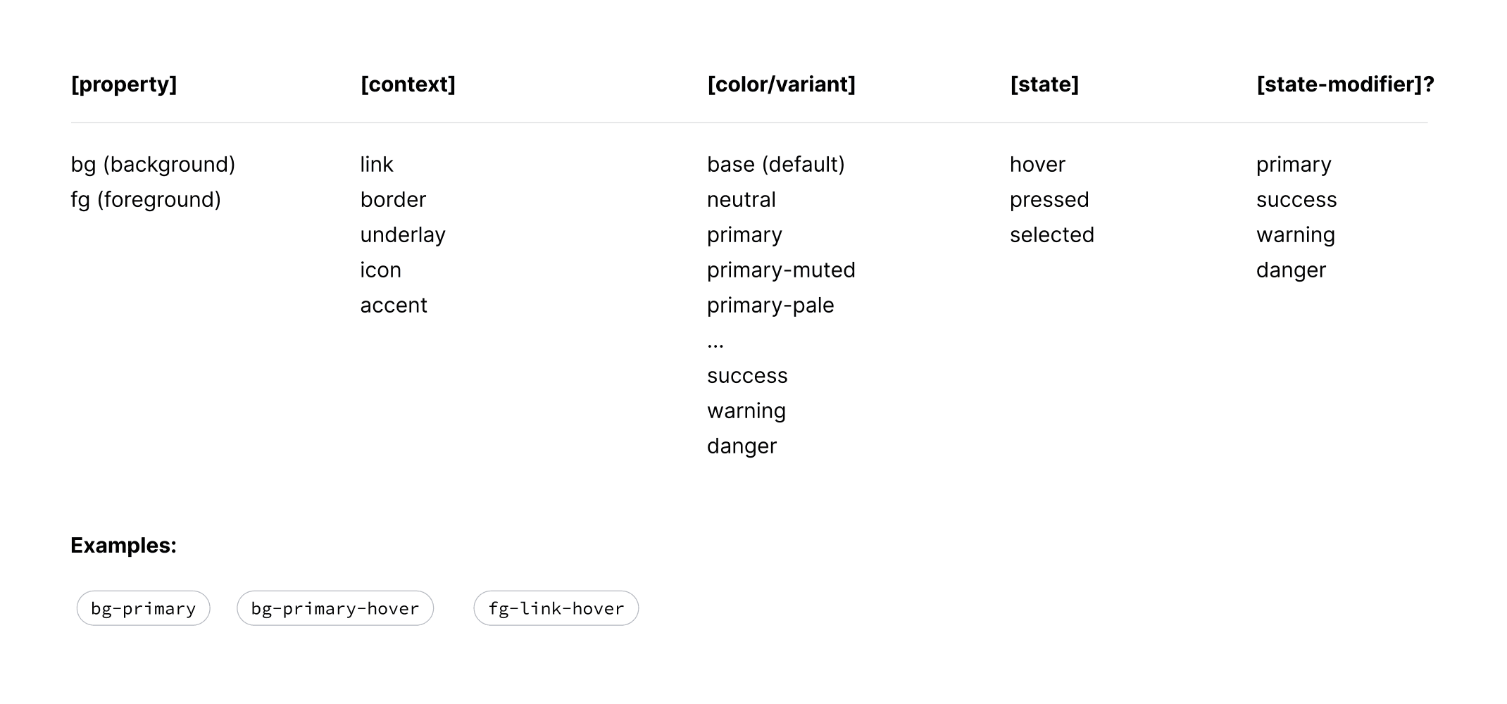
By the time it shipped, the template had settled into four families: bg, fg-text, fg-icon and border, plus fg-link for links. A few real examples:
bg-base
Page body
#ffffff
bg-surface-5
Container backgrounds
#eef0f9
bg-primary
Solid primary buttons
#5d57e1
bg-danger-muted
Soft danger backgrounds
#fff0f0
fg-text-base
Body copy
#343a55
fg-icon-primary
Primary icons
#5d57e1
border-input-selected
Selected inputs
#5d57e1
States live on the background
Most background tokens come with state variants (hover, pressed, selected and disabled), and they always move in the same direction.
bg-primary states
muted
#f3f3ff
disabled
#d1d0fe
default
#5d57e1
hover
#4640b9
pressed
#332e87
Text works differently. Our rule: state is always shown by the background, except for disabled. A button's label stays the same color whether it's hovered or pressed, so text tokens have no hover or pressed variants. Links are the one exception: they have no container to change, so fg-link-base-hover exists and fg-text-base-hover doesn't.
Instead of states, text gets a strength scale. Everything down to muted passes AA on white:
fg-text · contrast on white
base-strong
#181b2a
17.09:1
base
#343a55
11.16:1
base-soft
#495173
7.76:1
base-muted
#5e6993
5.36:1
base-ghost
#7782ad
3.76:1
Surfaces
Surfaces are background colors that give designers flexibility for containers. They're numbered by depth, so bg-surface-1 is barely off-white and bg-surface-90 is almost black. A separate bg-surface-dark-* set stays dark in every theme. We needed it for the data grid.
bg-surface
surface-1
#f9fbff
surface-5
#eef0f9
surface-10
#dfe2ee
surface-70
#949dc0
surface-90
#181b2a
Accent colors, more than a dozen hues like teal, olive and rose, exist too, but only for pills and schema field icons. They're deliberately kept out of everything else.
How it ships
Tokens are CSS custom properties on :root, stored as RGB channels. Each one becomes a Tailwind utility with exactly the same name, so the class in code is the token in Figma:
:root {
  --bg-primary: 93 87 225;
  --bg-primary-hover: 70 64 185;
  --fg-text-base: 52 58 85;
}

.bg-primary {
  --tw-bg-opacity: 1;
  background-color: rgba(var(--bg-primary) / var(--tw-bg-opacity, 1));
}
Because values are channels, any token can take an opacity without a new variable, and switching themes means swapping one set of custom properties.
The result
Baukasten now has around 240 color tokens, and none of them is tied to a single component. Designers pick colors by role instead of by shade, engineers write the same names in their classes, and the name itself says where a color belongs.