
Our filter bar originally used a multi-select component, but it took up too much space once more than three items were selected. Because the locale picker came before all the other filters, every new selection pushed the rest of the row aside, and the UI quickly became cluttered.
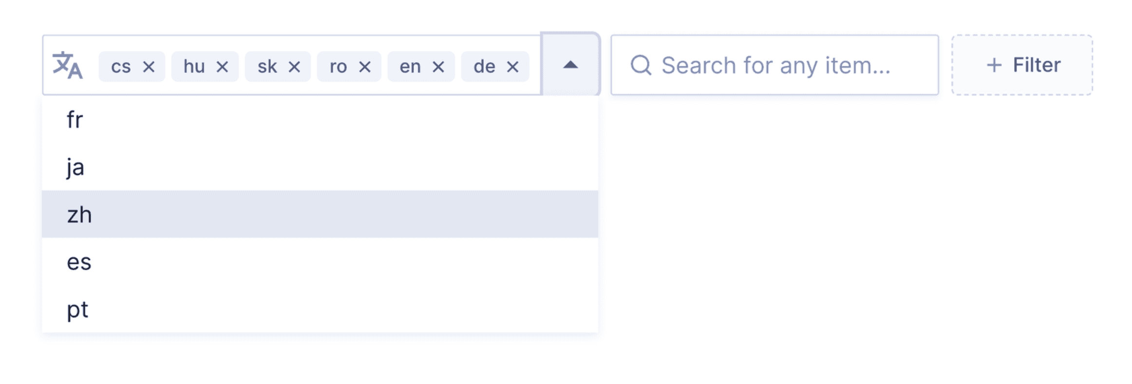
A new component: CheckboxSelect
To solve this, we designed a new component: CheckboxSelect, a more compact, accessible and scalable solution. We built it on React Aria's ListBox, with full keyboard navigation and screen reader support, and added search so long lists stay easy to work with.
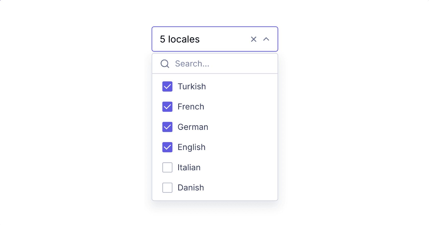
Summarising the selection
Instead of displaying every selected item individually, CheckboxSelect summarises the selection, for example "5 locales" or "Kangaroo, Penguin, +3 more". It's easier to read and it keeps the trigger the same size no matter how many items are selected.
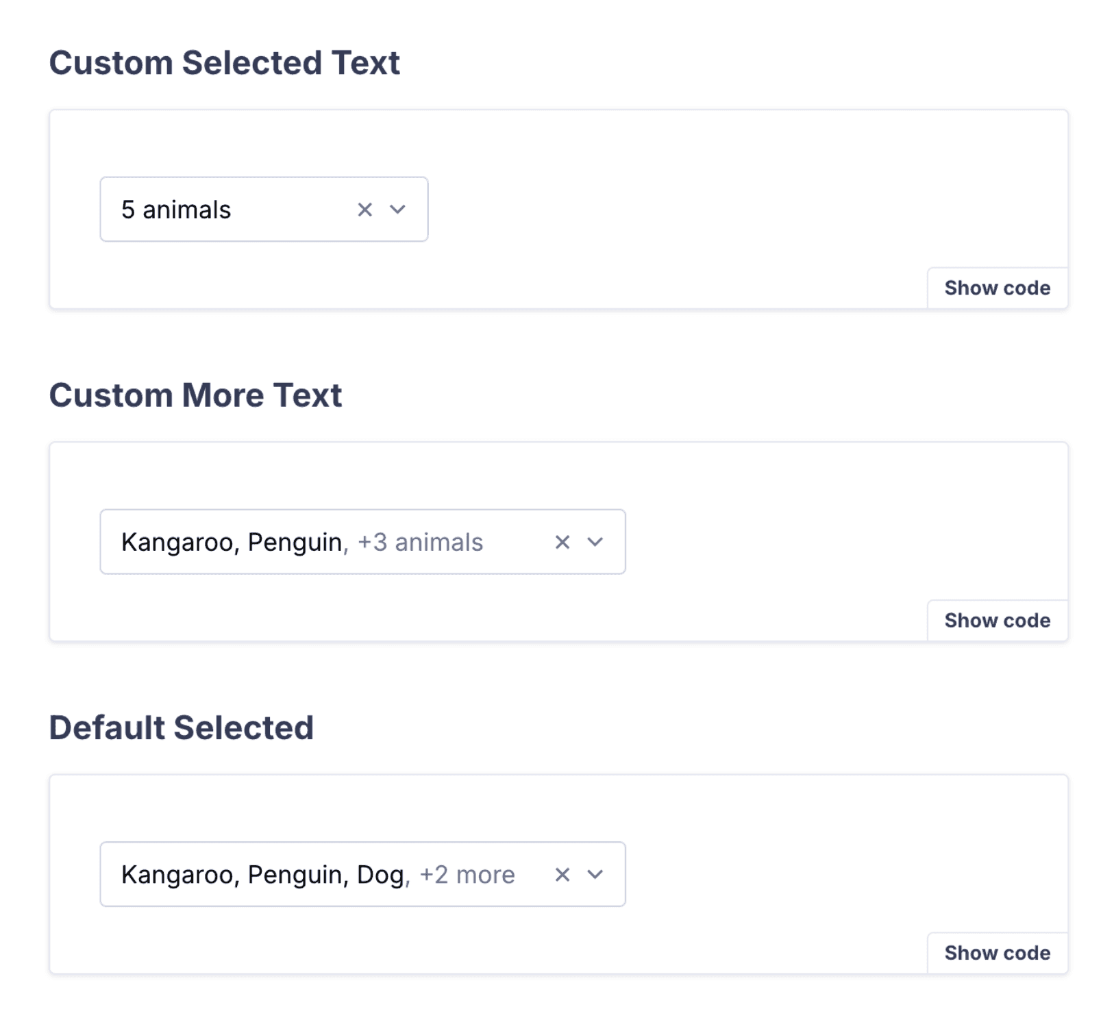
Customisable text
We made the selected text customisable, so each product surface can show a count, the item names or a combination of both. For example, the "+3 animals" label above comes from a moreText function:
<CheckboxSelect
  moreText={(count) => `, +${count} ${count === 1 ? "animal" : "animals"}`}
>
  {/* options */}
</CheckboxSelect>
The result
With this redesign the filter bar stays clean and predictable: selections are clear at a glance without overwhelming the rest of the UI, and the component works the same way with a mouse, a keyboard or a screen reader.